미디어 타입
all: 모든 미디어 타입
aural: 음성 합성 장치
braille: 점자 표시 장치
handheld: 손으로 들고 다니면서 볼 수 있는 작은 스크린에 대응하는 용도
print: 인쇄 용도
projection: 프로젝터
screen: 컴퓨터 스크린
tty: 디스플레이 능력이 한정된 텔렉스, 터미널, 또는 수동 이동 장치등 고정 된 글자를 사용하는 미디어
tv: 음성과 영상이 동시 출력 되는 장치
embrossed: 페이지에 인쇄된 점자 표지 장치
속성
width: 웹페이지의 가로 길이를 판단
height: 웹페이지의 세로 길이를 판단
device-width: 단말기의 물리적인 가로길이를 판단. 즉 기기의 실제 가로 길이를 판단
device-heght: 단말기의 물리적인 세로길이를 판단. 즉 기기의 실제 세로 길이를 판단
orientation: width와 height를 구하여 width 값이 길면 landscape로 height 값이 길면 portrait로 판단
aspect-ratio: width/height 비율을 판단합니다.
adevice-aspect-ratio: 단말기의 물리적인 화면 비율을 판단
color-index: 단말기에서 사용하는 최대 색상수를 판단
monochrom: 흑백 컬러만을 사용하는 단말기에서 흰색과 검은색 사이의 단계를 판단
resolution: 지원하는 해상도를 판단. 값으로 dip(인치당 도트 수)나 dpcm(cm당 도트 수)를 사용
color: 단말기에서 사용하는 최대 색상 수의 비트 수를 판단. 자연수를 쓰지만 2의 지수를 듯합니다.
ex) 1은 2, 2는 4, 3은 8
<!DOCTYPE html PUBLIC "-//W3C//DTD XHTML 1.0 Transitional//EN"
"http://www.w3.org/TR/xhtml1/DTD/xhtml1-transitional.dtd">
<html xmlns="http://www.w3.org/1999/xhtml" lang="ko" xml:lang="ko">
	<head>
		<meta name="generator" content="editplus" />
		<meta name="author" content="" />
		<meta name="keywords" content="" />
		<meta name="description" content="" />
		<meta http-equiv="content-type" content="text/html;charset=utf-8" />
		<title> new document </title>
		<!-- <link rel="stylesheet" type="text/css"  href="css/mid_1.css" media="all" /> -->
		<!--
		//외부처리방식
		<link rel="stylesheet" type="text/css" href="css/mid_3.css" media="(min-width:761px)" />
			//761이상에서만 실행
		<link rel="stylesheet" type="text/css" href="css/mid_2.css" media="(max-width:760px)" />
		<link rel="stylesheet" type="text/css" href="css/mid_1.css" media="(max-width:480px)" />
			//480이하에서만 실행
		-->
		<!--
		//내부처리방식
		<style type="text/css" media="(min-width:761px)">
			body{background:red;}
		</style>
		<style type="text/css" media="(max-width:760px)">
			body{background:blue;}
		</style>
		<style type="text/css" media="(max-width:480px)">
			body{background:yellow;}
		</style>
		 -->
		<style type="text/css">
			/* @media 메체선택(all, screen, tv, print, projection ...) */
			@media screen and (min-width:761px) {
				body{background:red;}
			}
			/* 위와 같이 띄어쓰기를 분명히 해준다 */
			@media screen and (max-width:760px) {
				body{background:blue;}
			}
			@media screen and (max-width:480px) {
				body{background:yellow;}
			}
		</style>
	</head>
	<body>
	</body>
</html>
미디어쿼리 예제
<!DOCTYPE html PUBLIC "-//W3C//DTD XHTML 1.0 Transitional//EN" "http://www.w3.org/TR/xhtml1/DTD/xhtml1-transitional.dtd">
<html xmlns="http://www.w3.org/1999/xhtml" lang="ko" xml:lang="ko">
	<head>
		<meta name="generator" content="editplus" />
		<meta name="author" content="" />
		<meta name="keywords" content="" />
		<meta name="description" content="" />
		<meta http-equiv="content-type" content="text/html;charset=utf-8" />
		<title> new document </title>
		<style type="text/css">
			*{margin:0;padding:0}
			li{list-style:none}
			#wrap{margin:0 auto;max-width:1000px} /* 최대1000px까지 늘어남 wrap은 width에 %를 넣지않는다. */
			#gnb{}
			#gnb li{float:left;width:25%;*width:24.8%;border:1px solid #999;box-sizing:border-box}
			#gnb:after{display:block;clear:both;content:""}
			#header{min-height:80px;background:aqua;}
			#container{background:pink;}
			#lftContent{float:left;/* padding-left:20px; */padding-left:2%;width:18%;height:300px;background:red}
			/* 페딩계산법20/1000*100 */
			#cenContent{float:left;width:60%;height:300px;background:green}
			#rgtContent{float:right;width:20%;height:300px;background:blue}
			#footer{clear:both;height:80px;background:purple}

			@media (max-width:800px) {
				#lftContent{width:28%;}
				#cenContent{width:70%;}
				#rgtContent{float:none;clear:both;width:100%;}
				#gnb li{width:50%}
			}
			@media (max-width:480px) {
				#lftContent,#cenContent,#rgtContent{float:none;width:100%;}
				#rgtContent{float:none;clear:both;width:100%;}
				#gnb li{width:100%}
				h1{text-align:center;}
			}
			body{min-width:320px;} /* body, wrap 둘 중 한곳에 넣으면 320px이하로 줄지 않는다. */
		</style>
	</head>
	<body>
		<div id="wrap">
			<div id="header">헤더영역
				<h1>LOGO</h1>
				<h2>메인메뉴</h2>
				<ul id="gnb">
					<li><a href="#">메뉴1</a></li>
					<li><a href="#">메뉴2</a></li>
					<li><a href="#">메뉴3</a></li>
					<li><a href="#">메뉴4</a></li>
				</ul>
			</div>
			<!-- //header -->
			<div id="container">
				<div id="lftContent">왼쪽</div>
				<!-- //lftContent -->
				<div id="cenContent">가운데</div>
				<!-- //cenContent -->
				<div id="rgtContent">오른쪽</div>
				<!-- //rgtContent -->
			</div>
			<div id="footer"></div>
			<!-- //footer -->
		</div>
	</body>
</html>
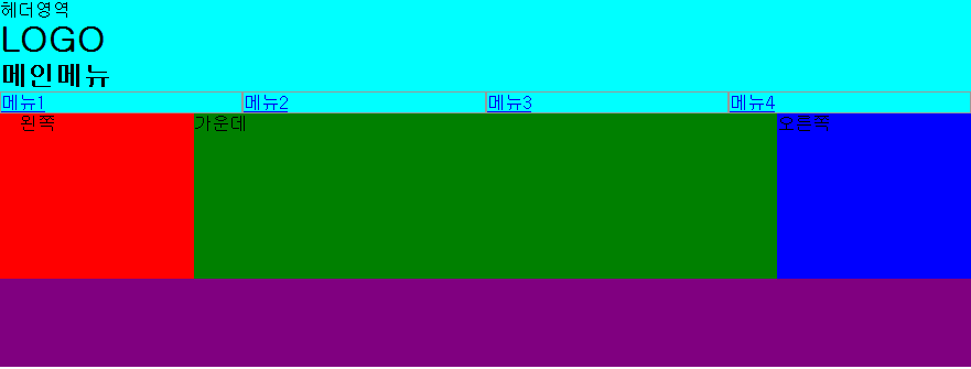
width:800px보다 클때
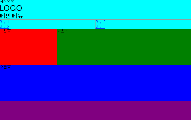
width:800이하일때
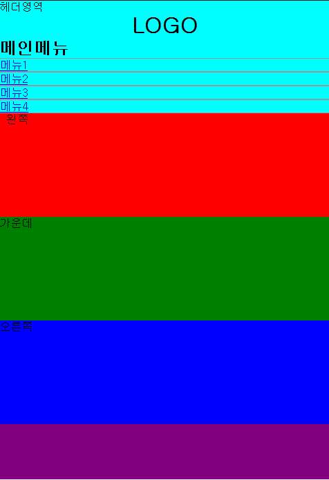
width:480px 이하일때
html5 박스 모델
댓글 0
댓글 쓰기 권한이 없습니다.
| 30 | 서브라임 설치 및 플로그인 설명 |
| > | 140811_미디어쿼리 |
| 28 | 140809_css3 |
| 27 | 링크 |
| 26 | 모바일 화면제어 |
| 25 | 슬라이드 메뉴 |
| 24 | 0814-1 |
| 23 | 140813_엘리먼트 사용브라우저 확인, 작성한 아웃라인 확인 사이트 |
| 22 | html5-미디어쿼리 예제 링크 |
| 21 | 140808_html5 구조 |
| 20 | jqury 특강2 |
| 19 | 특강 jquery |
| 18 | 프로그램에 젠코딩 플러그인 설치하는 방법 |
| 17 | 140719_웹폰트, reset 방법 |
| 16 | 140708_html5 링크 |
| 15 | 140704_마크업, 스타일 적용 |
| 14 | 140703_position |
| 13 | 140702_display,float,overflow |
| 12 | 140701_마진겹칩오류 해결법 |
| 11 | 140630_정렬 |