text-shadow
text-shadow:x축 y축 블러효과 컬러;
ex) text-shadow:5px 5px 0 #ccc;
컬러는 rgba로 표현 할 수 있다. a가 1일때 선명해진다.
IE사용( 7버젼부터 text-shadow 사용가능)
filter:progid:DXImageTransform.Microsoft.dropshadow(OffX=5, OffY=5, Color=#ccc, Positive=true);
display:inline-block; zoom:1;
<!DOCTYPE HTML>
<html lang="ko">
<head>
	<meta charset="UTF-8">
	<title></title>
	<style type="text/css">
		h1{text-shadow:3px 3px 3px rgba(0,0,0,0.9)}
	</style>
</head>
<body>
	<h1>웹표준 웹접근성</h1>
</body>
</html>
word-wrap
word-wrap:break-word;
1byte 문자열이 공백없이 등장하는 모든 브라우저들은 이를 하나의 단어로 해석하기 때문에 개행하지 않는다. 이것을 강제로 개행할 수 있다. 모든 브라우저가 이 속성을 지원한다.
opacity
투명도
opacity:0.5;
IE에서 사용
filter:alpha(opacity=50);
<!DOCTYPE HTML>
<html lang="ko">
<head>
	<meta charset="UTF-8">
	<title></title>
	<style type="text/css">
		p:nth-child(1){width:200px;background:yellow;word-wrap:break-word;opacity:0.5;/* op:ie 젠코딩약어 */filter:progid:DXImageTransform.Microsoft.Alpha(Opacity=50);}
		/* word-wrap:break-word - 강제로 줄바꿈함 게시판 사용시 */
		p:nth-child(2){background:aqua;white-space:nowrap;overflow:hidden;text-overflow:ellipsis}
		/*p:nth-child(2) body의 자식요소중 2번째 ie8버전에서 사용 안됨 */
	</style>
</head>
<body>
	<p>aaaaaaaaaaaaaaaaaaaaaaaaaaaaaaaaaaaaaaaaaaaaaaaaaaaaaaaaaaaaaaaaaaaaaaaaaaaaaaaaaaaaaaaaaaaaaaaaaaaaaaaaaaaaaaaaaaaaaaaaaaaaaaaaaaaaaaaaaaaaaaaaaaaaaaaaaaaaaaaaaaaaaaaaaaaaaaaaaaaaaaaaaaaaaaaaaaaaaaaaaaaaaaaaaaaaaaaaaaaaaaaaaaaaaaaaaaaaaaaaaaaaaaaaaaaaaaaaaaaaaaaaaaaaaaaaaaaaaaaaaaaaaaaaaaaaaaaaaaaaaaaaaaa</p>
	<p>안녕하세요. 반갑습니다.안녕하세요. 반갑습니다.안녕하세요. 반갑습니다.안녕하세요. 반갑습니다.안녕하세요. 반갑습니다.안녕하세요. 반갑습니다.안녕하세요. 반갑습니다.안녕하세요. 반갑습니다.안녕하세요. 반갑습니다.안녕하세요. 반갑습니다.</p>
</body>
</html>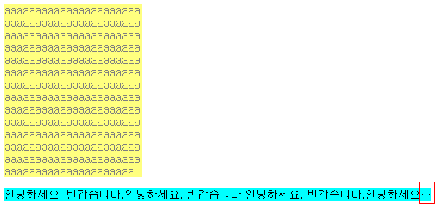
box-shadow
box-shadow:X축 Y축 blur 그림자색;
box-shadow:5px 5px 5px silver;
-moz-box-shadow:5px 5px 5px silver;
-webkit-box-shadow:5px 5px 5px silver;
filter:progid:DXImageTransform.Microsoft.Shadow(color=silver,direction=135,strength=20);
border-radius
둥근 모서리 박스
border-radius:leftop, righttop, rightbottom, leftbottom;
border-radius:leftop rightbottom, righttop leftbottom ;
border-radius:5px 5px 5px 5px;
-moz-border-radius:5px;
-webkit-border-radius:5px;
border-radius:30px 0;
-moz-border-radius:30px 0;
-webkit-border-top-left-radius:30px 0;
-webkit-border-bottom-right-radius:30px 0;
원하는 방향에만 적용하는 경우, 웹킷 브라우저 가운데 사파리4가 단축 속성을 지원하지 않아 현재로써는 단축 속성을 사용할 수 없다.
<!DOCTYPE HTML>
<html lang="ko">
<head>
	<meta charset="UTF-8">
	<title></title>
	<style type="text/css">
		#box1{
			margin-bottom:30px;
			width:100px;height:100px;
			background:red;
			box-shadow:10px 10px 10px rgba(0,0,0,0.9);
			border-radius:5px 5px 5px 5px
		}
		#box2{
			width:100px;height:100px;
			background:red;
			box-shadow:10px 10px 10px rgba(0,0,0,0.9);
			border-radius:50px 50px 50px 50px
		}
	</style>
</head>
<body>
	<div id="box1"></div>
	<div id="box2"></div>
</body>
</html>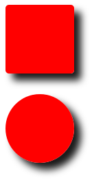
boxsizing
모바일버젼 사용
pc버젼에서는 사용하지 않는 것이 좋다.
#box:hover{width:200px;height:200px}
background(s)
백그라운드를 여러개 사용할 수 있다.
background:
url(bg.gif) no-repeat left top,
url(bg.gif) no-repeat right top,
url(bg.gif) no-repeat left bottom,
url(bg.gif) no-repeat right bottom
<!DOCTYPE HTML>
<html lang="ko">
<head>
	<meta charset="UTF-8">
	<title></title>
	<style type="text/css">
		#box3{
		width:500px;height:300px;
		background:yellow;
		background:url("http://placehold.it/10x10") no-repeat left top,
			url("http://placehold.it/20x20") no-repeat right top,
			url("http://placehold.it/30x30") no-repeat left bottom,
			url("http://placehold.it/40x40") no-repeat right bottom
		}
	</style>
</head>
<body>
	<div id="box3"></div>
</body>
</html>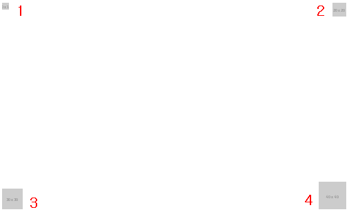
※ http://placehold.it/200x100이라는 사이즈의 이미지를 가져올수 있다
gradient
background:#3eafoe -webkit-gradient(linear, 0%(x축) 0%(y축)(시작점), 0%(x축) 100%(y축)(끝점), from(#0f0), to(#fff);
background:#3eafoe -moz-gradient(top, #0f0, #fff);
filter:progid:DXImageTransform.Micosoft.gradient(startColorStr=#0f0, endColorStr=#fff)
<!DOCTYPE HTML>
<html lang="ko">
<head>
	<meta charset="UTF-8">
	<title></title>
	<style type="text/css">
		#box4{
			width:400px;height:300px;background: #00ff00; /* Old browsers */
			background: -moz-linear-gradient(top, #00ff00 0%, #ffffff 100%); /* FF3.6+ */
			background: -webkit-gradient(linear, left top, left bottom, color-stop(0%,#00ff00), color-stop(100%,#ffffff));
			/* Chrome,Safari4+ */
			background: -webkit-linear-gradient(top, #00ff00 0%,#ffffff 100%); /* Chrome10+,Safari5.1+ */
			background: -o-linear-gradient(top, #00ff00 0%,#ffffff 100%); /* Opera 11.10+ */
			background: -ms-linear-gradient(top, #00ff00 0%,#ffffff 100%); /* IE10+ */
			background: linear-gradient(to bottom, #00ff00 0%,#ffffff 100%); /* W3C */
			filter: progid:DXImageTransform.Microsoft.gradient( startColorstr='#00ff00', endColorstr='#ffffff',GradientType=0 ); /* IE6-9 */
		}
	</style>
</head>
<body>
	<div id="box4"></div>
</body>
</html>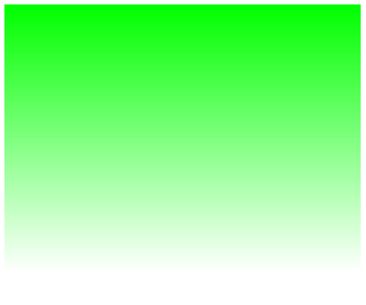
font-face
외부 글꼴을 가져온다
@font-face{
font-family:'Nanum Gothic';
src:url(/v3/NanumGothic-Bold.eot);
src:url(/v3/NanumGothic-Bold.eot?#iefix) format('embedded-opentype'),
url(/v3/NanumGothic-Bold.ttf) format('truetype');
}
transition
#box{
background-color:#ffo;
width:90px;height:50px;
transition:all 2s linear; //transition-property, transition-duration, transition-timing-function:
}
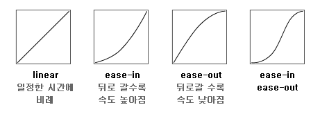
all - 속성, 트렌지션 전체의 반환값 모두 적용, 한가지만 적용될 때 width라고 적어준다.
2s - 속도
linear - 가속도
<!DOCTYPE HTML>
<html lang="ko">
<head>
	<meta charset="UTF-8">
	<title></title>
	<style type="text/css">
		*{margin:0;padding:0}
		/* #box{width:50px;height:50px;background:yellow;transition:all 2s linear} */

		/* #box{width:50px;height:50px;background:yellow;transition:width 2s linear}
		#box:hover{width:200px;height:200px;} */

		li{list-style:none}
		a:link,a:visited,a:focus{text-decoration:none;color:#333}
		a:hover{color:#999}
		#gnb{}
		#gnb > li > a{font-weight:bold;color:green}
		#gnb > li{position:relative;float:left;width:200px;height:40px;border:1px solid red;text-align:center;}
		#gnb > li:hover ul{display:block;height:200px}
		#gnb ul{/* display:none; */position:absolute;left:0;top:40px;width:100%;height:0;border:1px solid blue;text-align:center;overflow:hidden;transition:all 1s linear}
		/* 자바스크립트가 안되도 사용가능하나 탭키로 이동은 안된다. */
	</style>
</head>
<body>
	<!-- <p id="box">박스</p> -->
	<ul id="gnb">
		<li><a href="">메뉴1</a>
			<ul>
				<li><a href="">서브메뉴1-1</a></li>
				<li><a href="">서브메뉴1-2</a></li>
			</ul>
		</li>
		<li><a href="">메뉴2</a>
			<ul>
				<li><a href="">서브메뉴2-1</a></li>
				<li><a href="">서브메뉴2-2</a></li>
			</ul>
		</li>
	</ul>
</body>
</html>animation
<style type="text/css">
#box{
background-color:#ff0;
width:50px;height:50px;
animation:themove 4s infinite alternate;
}
animation-name: themove (애니메이션명)
animation-duration: 4s (동작시간)
infinite : 반복실행
animation-direction: 기본값은 normal, reverse, alternate, aaltenamte-reverse가 있음
@-moz-keyframes themove{
20%{
width:500px;
}
50%{
width:200px;
}
100%{
width:200px;
}
}
@- 선택자가 아니라고 명시
keyframes: 애니메이션 작성할 때 명령어
20% : 4초 20%(0.8초)에 실행
<!DOCTYPE HTML>
<html lang="ko">
<head>
	<meta charset="UTF-8">
	<title></title>
	<style type="text/css">
		*{margin:0;padding:0}
		#box2{position:relative;left:0;top:240px;background:yellow;width:50px;height:50px;animation:kkk 5s linear infinite alternate}
		@-moz-keyframes kkk{
			10%{
				left:100px;
			}
			40%{
				top:500px;
			}
			70%{
				top:0px;
			}
			100%{
				left:500px;
			}
		}
		@-webkit-keyframes kkk{
			10%{
				left:100px;
			}
			40%{
				top:500px;
			}
			70%{
				top:0px;
			}
			100%{
				left:500px;
			}
		}
	</style>
</head>
<body>
	<p id="box2"></p>
</body>
</html>※ 구글 제공 나눔 폰트
(https://www.google.com/fonts/earlyaccess)
1.Nanum Brush Script(Korean)
@import url(http://fonts.googleapis.com/earlyaccess/nanumbrushscript.css);
ex>font-family: 'Nanum Brush Script', cursive;
2. Nanum Gothic(Korean)
@import url(http://fonts.googleapis.com/earlyaccess/nanumgothic.css);
min-width, max-width
<!DOCTYPE HTML>
<html lang="ko">
<head>
	<meta charset="UTF-8">
	<title></title>
	<style type="text/css">
		.photo{/* max-width:100%; */ min-width:100%}
		/* min-width:100%모바일에서 이미지에 사용하지않는다. */
		/* img,video{max-width:100%;} 이미지와 비디오를 리셋에 가변성 있도록 설정함다. */
	</style>
</head>
<body>
	<img src="http://placehold.it/800x300" alt="" class="photo" />
	<!-- 모바일 사이트는 이미지를 크게 작업
	이미지는 원본사이즈보다 커지지않게 한다.-max-width:100%; -->
</body>
</html>댓글 쓰기 권한이 없습니다.
| 30 | 서브라임 설치 및 플로그인 설명 |
| 29 | 140811_미디어쿼리 |
| > | 140809_css3 |
| 27 | 링크 |
| 26 | 모바일 화면제어 |
| 25 | 슬라이드 메뉴 |
| 24 | 0814-1 |
| 23 | 140813_엘리먼트 사용브라우저 확인, 작성한 아웃라인 확인 사이트 |
| 22 | html5-미디어쿼리 예제 링크 |
| 21 | 140808_html5 구조 |
| 20 | jqury 특강2 |
| 19 | 특강 jquery |
| 18 | 프로그램에 젠코딩 플러그인 설치하는 방법 |
| 17 | 140719_웹폰트, reset 방법 |
| 16 | 140708_html5 링크 |
| 15 | 140704_마크업, 스타일 적용 |
| 14 | 140703_position |
| 13 | 140702_display,float,overflow |
| 12 | 140701_마진겹칩오류 해결법 |
| 11 | 140630_정렬 |