It's quite common among designers to believe that following trends is a crucial part of their job. Being constantly up-to-date is seen as mandatory. Many designers evaluate the work of others through a prism of trends - tagging something as #old can be seen as an insult, as if not fitting the most recent style would automatically make the whole project less valuable.
However, there are reasons to follow the trends. Visiting such websites as Awwwards, FWA or CSS design awards may inspire you and as a result, help you to venture outside of your design habits. You can learn about the new visual worlds, which you can then (consciously or not) integrate with your graphic language. Watching the work of others helps you to keep on improving your skills while being up-to-date when it comes to the latest technologies.
In the last year or two, it has become noticeable that many designers are trying to move away from simple and closed compositions. More and more open-styled, seemingly chaotic, “broken” and cut compositions are being created. The previously worshiped grid lost its importance and its rules were deliberately and consciously bent. Content started to be shifted, seemingly moved, its parts sometimes overlapped and intermingled.
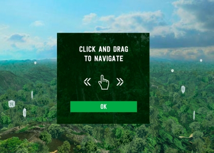
A great role in this process is played by the evolution of Canvas and WebGL. Modern projects are often a bit confusing, less intuitive than the minimalist ones, but they make a really strong, lasting impression on users.
What else is waiting for us in web design in 2017? Check out the rest of my predictions.
Open composition
Until recently the design world was dominated by compositions which were closed, symmetric, and static. With 2016 came a lot of websites that strayed from this style. Open compositions of loosely suspended elements that are fleeing somewhere off-screen are gaining popularity - examples of such work can be seen at romainpsd.com, durimel.io, or booneselections.com. Distribution of elements on these websites gives the impression that they still "exist" somewhere beyond the edge of the monitor.
Asymmetry
2016 also broke the rule of symmetry, which dominated the industry for quite a long time. Many designers created asymmetric layouts which are not perfectly balanced on the left and right sides. As examples I would like to show you a great website culture.pl, a chaotic dada-data.net, and previously mentioned durimel.io.
Greater diversity
Designers created more dynamic compositions that have larger amounts of intersecting diagonal lines (poigneedemainvirile.com, vanderlanth.io), or that were based on more complex (residente.com/en)/organic shapes (helloheco.com, predictiveworld.watchdogs.com).
The apparent chaos
In 2016, many designers consciously and deliberately began to move away from the minimalistic way of composing. There was a desire for greater freedom and a less rigid approach to designing. Behind it certainly stands a need for making a change, but also an ordinary sense of boredom. At some point everyone will get fed up with creating simple layouts with simply arranged elements.
However, while analyzing the projects from 2016 it became noticeable that the chaos is only apparent. Layouts are still based on the classic contrast of forms, colors, textures, sizes, etc. What has changed is the location of the different elements and the harmony of dependency between them. Currently, items such as headers, icons, or paragraphs are deployed more often, as if in spite of trite logic. Despite being a part of a single theme block, they are split apart and situated a fair distance from each other. They are not aligned to one of the edges of the container and have different paddings.
There are geometric figures "suspended in mid-air" that only have a decorative purpose (melanie-f). It's also characteristic to overlap elements on each other. Texts partially overlap the photos, such as on e03.epicurrence.com and melville-design.com, or images overlap each other, which can be seen on olivierbernstein.com.
It's also a distinctive procedure to disrupt the typical minimalist harmony. Enormous headlines contrast sharply with delicate and thin decorations and separators.
Richer background and patterns
Increasingly, there are more backgrounds and patterns used in web design, for instance small dashes, stripes, or dots.
Especially common is the grid pattern, which is treated as a "frame" for the other elements of the layout. Those elements are moved over the grid on the parallax principle and often are arranged in a chaotic manner.
Grid pattern
One of the first sites that used the grid pattern was werkstatt.fr, which didn’t use the characteristic movements.
A slightly different way of using grid pattern is showed on klimov.agency, brand.uber.com, and maisonullens.com. In those cases it has a very specific function - to make all movement of elements logical. It allows to rationalize unconventional decisions and provides answers to questions like "why is the edge of an illustration not in harmony with the edge of a button?". It creates a rhythm and at the same time justifies its violations.
On freebies.lorenzobocchi.com content is already loosely arranged when it comes to the grid, similarly to the previously mentioned e03.
Decorative Details
What has also recently changed is the approach to details. There is a gradual departure from the minimalistic, raw Form Follow Function. There are many more elements that only have decorative functions. "Flying" geometric figures or fragments thereof are common. Linear, rickety icons are slightly detached from the content they illustrate. Underscores and separators are getting shifted. There are digital noises and glitches, as on bigyouth.fr or kikk.be.
Buttons are less frequently created as harsh rectangles with texts inserted in the middle. They are often designed as soft, shifted dashes, such as on dahllaw.dk or yasuhiroyokota.com. Another button style is to create spectacular hovers in Canvas, just like on hpsoundincolor.com and cavalierchallenge.com.
Thought out narratives - smooth animations between sections
Animations on websites are nothing new. You also can't say that they are at odds with the minimalist approach. However, as well as Canvas, they are a component of greater possibilities in web design. New opportunities are always tempting as they allow you to do something different, fresh, and original.
The richness of animation leads to elimination of the rigid division into sections of the page. A website smoothly changes itself during scrolling. Content disappears and appears with a soft animation. The sequences of these transitions are becoming more thought out. They are not just some random effects between blocks of content, but staged narratives where each element appears at a scheduled time (Nationalgeographic.com, stylenovels.com). Animations are part of a website from the beginning of its creation, not just a casually added detail.
Interesting animations enrich simple layouts. They add a new value and constitute the uniqueness of the page. They are the essence of the whole project, such as on Ifly50 or tennentbrown.co.nz. They often create beautiful, smooth structure on websites, such us on Cuberto.com, lookbook.wedze.com, skarv-fashion.com or corentinfardeau.fr.
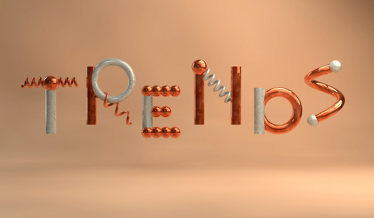
Rich typography
The change in trends can also be seen in the typefaces used. Until recently, the entire Internet was dominated by simple neo-grotesque styles, such as Helvetica, Roboto, Lato, or Open Sans. A bit more "decorative" Neo-grotesque was most commonly used in headlines, while its simpler style was frequently chosen for paragraphs. Serif typefaces were not used very often.
Over the last 2 years things have started to change. Designers boldly use different kinds of typefaces. Now they are more willing to work with contrasts - serif typefaces with the non-serif ones.
A lot is going on in typography used in websites. Texts are animated, broken down into individual letters, a variety of effects, images, and videos is placed on them.
Greater technological capabilities and more courageous decisions affect the growth of diversity when it comes to web typography.
Geometric typefaces
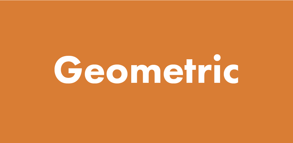
Sans serif geometric typefaces gained more popularity, for instance such classics as Futura, ITC Avant Garde, Proxima Nova, or the ones that are available in the Google Library - Poppins and Montserrat. These typefaces are much more distinctive than the"invisible", neo-grotesque ones. A more "aggressive" and expressive character of a website can be especially achieved with the use of thicker weight, what is shown on hugeinc.com, which is quite an old website, or the newer ones, such as sequence.co.uk, startuplab.no or www.protest.eu.
Serif typefaces
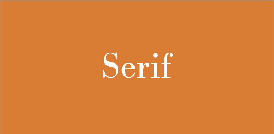
It is very common to use serif typefaces - not only in paragraphs or signatures but also in large headlines. The ones with larger decorative value are used especially often, such as on duhaihang.com or jennyjohannesson.com. The other typefaces that are also very popular are the ones that refer to Bodoni or Didot.
Monospaced typefaces ("typewriter")
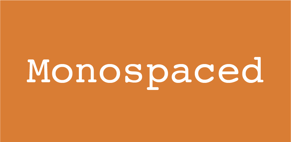
It's a novelty to use proportional typefaces that are typically associated with typewriters - they can be seen on such websites as admirhadzic.com, cuberto.com or designembraced.com.
Contrasting pairing of typefaces
In 2016, it was common to move away from soft, harmonious pairing of typefaces for stronger contrast. Expressive combinations were reinforced by a high contrast between the sizes of texts. Large and decorative serif typefaces were combined with simple geometric ones, just as headers with geometric fonts were paired up with a serif ones in paragraphs.
Large typography as part of the key visual
A very cool, frequently chosen thing to do was to use very large sizes for texts in KV. It created a very strong contrast between headers and the rest of the content. An example of that can be seen on oursroux.com, femmefatale.paris or monsieurcaillou.com.
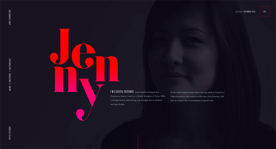
Lettering is sometimes used as a decoration in the form of an initial, such as on corentinfardeau.fr or nurturedigital.com.
A striking example of this can be found on the above-mentioned website jennyjohannesson.com, where decorative qualities of serif typeface Goku are used.
Additional effects imposed on typography
We can see a strong integration between typography and images, films or animations. Individual sections are internally coherent - typography interacts with both background and other elements. It became a thing of the past to haphazardly place typography on a dim picture. Currently, designers are creating interesting relations between all of the elements - weaving typography into the background, animating it, etc.
Larger letter sizes in paragraphs
When I started my adventure with web design, I had an old habit of using 10px typefaces, which I got from working as a print designer. However, I quickly realized that in the web world 14px is the size that is the most readable.
Currently, we can notice the use of much larger typefaces, which are especially popular when it comes to using the serif ones.
Embrace the dark side
In 2016 designers used a variety of colors. However, you may notice a subtle tendency to shift toward dimmer tones.
It got less popular to create websites that are completely white, in favor of using gradations of gray, textures, or patterns.Now it has become rather common to create darker websites, where black or its dark gradation fills the background and creates a slightly gloomy and sometimes bizarre mood.
Despite all of that, it's hard to predict that this trend will grow significantly during this year. Colors, however, are part of the visual identity of brands, so it's hard to expect that they will radically change their communication based purely on the popularity of certain trends.
Summary
2017 offers a lot of exciting prospects, but there are also some dangers on the horizon.
Personally, I am afraid that many web designers might get a little cocky when it comes to working with Canvas. Add new trends to it, and you will have a lot of websites that are too flashy and incomprehensible to a wider audience.
I'm also slightly worried about the fact that many of the modern creations won’t work properly on all browsers and mobile devices. I have the impression that we have come full circle. Right now we are in a situation similar to the times when Flash, despite ruling the Internet, was accused of lacking responsiveness and having high requirements for Internet connections.
The other thing that scares me is the fact that the new "deconstruction" tendencies may not appeal to commercial customers or simply won't fit the profile of their communication. (Banking or government websites shouldn't be too casual or create the impression of chaos.)
What makes me wonder is how long it will take for new trends to invade the commercial market. It should be noted that the vast majority of websites that I used as examples were created for agencies, designers, and the creative industry. Such websites often set their own rules and usually are ahead of trends in comparison to other industries. Sometimes it takes a lot of time for trends that are popular in this niche to break through to the commercial market. Then their form might end up getting a bit smoothed over to appeal to everyone.
Despite all that, I think that 2017 is looking quite promising when it comes to web design. Saying that minimalism will draw to an end might a bit over the top, but I'm sure that it's undergoing some changes and that it's evolving.
Minimalism is becoming more complicated and detailed. Websites created during this year will get even more "canvasy". We will see more of "apparent chaos", diversity and expression in the future projects. This is good news for designers that are fed up with the constant use of minimalist styles of Flat, Material, or Metro.
Perhaps my article is a too subjective. I might’ve even looked for significant trends in small repetitive elements that just caught my attention simply because I like them. If you think that minimalism is doing just fine,"the apparent chaos" is just a fad, and Canvas will end up like Flash, then share your opinion in the comments. But remember, you can also write something if you agree with me. ;)
By Paweł Pacura, graphic designer at Merixstudio